Widgets
A collection of reusable components for building full screen applications.
When in full_screen mode, the default key binder to exit the application is Ctrl-C, however you can set your own.
TextArea
A simple input field. This is a higher level abstraction on top of several other classes with sane defaults.
This widget does have the most common options, but it does not intend to cover every single use case. For more configurations options, you can always build a text area manually, using a
Buffer
BufferControl
Window
Buffer attributes
text- The initial text.multiline- If True, allow multiline input.completer-Completerinstance for auto completion.complete_while_typing- Boolean.accept_handler- Called when Enter is pressed (This should be a callable that takes a buffer as input).history-Historyinstance.auto_suggest-AutoSuggestinstance for input suggestions.
BufferControl attributes
password- When True, display using asterisks.focusable- When True, allow this widget to receive the focus.focus_on_click- When True, focus after mouse click.input_processors- None or a list ofProcessorobjects.type- None or aValidatorobject.
Window attributes
highlighter-Lexerinstance for syntax highlighting.wrap_lines- When True, don’t scroll horizontally, but wrap lines.width- Window width. (Dimensionobject.)height- Window height. (Dimensionobject.)scrollbar- When True, display a scroll bar.style- A style string.dont_extend_width- When True, don’t take up more width than the preferred width reported by the control.dont_extend_height- When True, don’t take up more width than the preferred height reported by the control.get_line_prefix- None or a callable that returns formatted text to be inserted before a line. It takes a line number (int) and a wrap_count and returns formatted text. This can be used for implementation of line continuations, things like Vim “breakindent” and so on.
Other attributes
search_field- An optional SearchToolbar object.
Frame
Draw a border around any container, optionally with a title text. Changing the title and body of the frame is possible at runtime by assigning to the body and title attributes of this class.
- Parameters
body- Another container object.title- Text to be displayed in the top of the frame (can be formatted text)style- Style string to be applied to this widget.width- Frame widthheight- Frame height.
from quo import container
from quo.widget import Frame, Label


root = Frame(
          Label("Hello, World!"),
          title="Quo: python")

@bind.add("ctrl-c")
def _(event):
       event.app.exit()

container(root, bind=True, full_screen=True)

Label
Widget that displays the given text. It is not editable or focusable.
- Parameters
text- Text to display. Can be multiline. All value types accepted byquo.layout.FormattedTextControlare allowed, including a callable.style- A style string.width- When given, use this width, rather than calculating it from the text size.dont_extend_width- When True, don’t take up more width than preferred, i.e. the length of the longest line of the text, or value of width parameter, if given. True by defaultdont_extend_height- When True, don’t take up more width than the preferred height, i.e. the number of lines of the text. False by default.
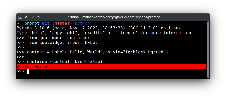
You can print the layout to the output in a non-interactive way like so:
from quo import container
from quo.widget import Label

content = Label("Hello, World", style="fg:black bg:red")
container(content)

To make it fullscreen set :param:`bind` and :param:`full_screen` to True Press Ctrl-C to quit
from quo import container
from quo.widget import Label

content = Label("Hello, World", style="fg:black bg:red")
container(content, bind=True, full_screen=True)

Adding a custom key binder
from quo import container
from quo.keys import bind
from quo.widget import Label

content = Label("Hello, World", style="fg:black bg:red")

#Press Ctrl-a to exit
@bind.add("ctrl-a")
def _(event):
   event.app.exit()

container(content, bind=True, full_screen=True)
Box
Add padding around a container.
This also makes sure that the parent can provide more space than required by the child. This is very useful when wrapping a small element with a fixed size into a VSplit or HSplit object.
The HSplit and VSplit try to make sure to adapt respectively the width and height, possibly
shrinking other elements. Wrapping something in a Box makes it flexible.
- Parameters
body- Another container object.padding- The margin to be used around the body. This can be overridden by :param:`padding_left`, :param:`padding_right`, :param:`padding_top` and :param:`padding_bottom` parameters.style- A style string.char- Character to be used for filling the space around the body. (This is supposed to be a character with a terminal width of 1.)
from quo import container
from quo.keys import bind
from quo.widget import Box, Label


content = Box(
            Label("Hello, World", style="fg:black bg:red"),
            padding=5)

# Press `q` to cancel
@bind.add("q")
def _(event):
    event.app.exit()

container(content, bind=True, full_screen=True)
Shadow
Draw a shadow underneath/behind this container. (This applies `class:shadow` the the cells under the shadow. The Style should define the colors for the shadow.)
- Parameters
body- Another container object.