Dialogs
Quo ships with a high level API for displaying dialog boxes to the user for informational purposes, or get input from the user.
All dialogs can be passed bg=False option to turn off the background. Added on v2022.4
Deprecated :meth:`.run` on v2022.3.2
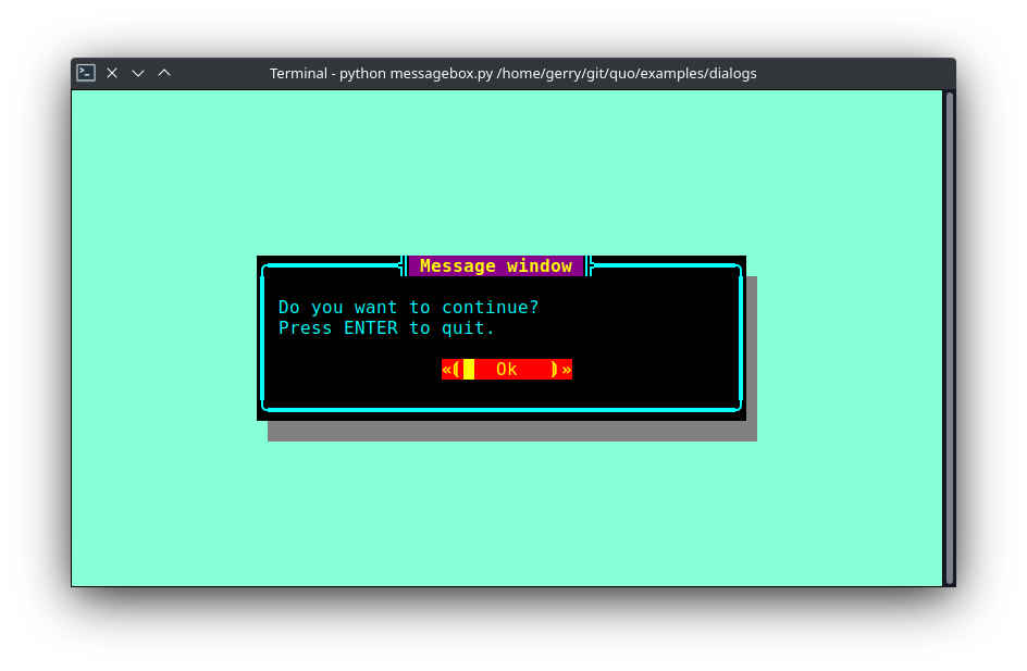
Message Box
Use the MessageBox() function to display a
simple message box. For instance:
from quo.dialog import MessageBox

MessageBox(
    title='Message window',
    text='Do you want to continue?\nPress ENTER to quit.')
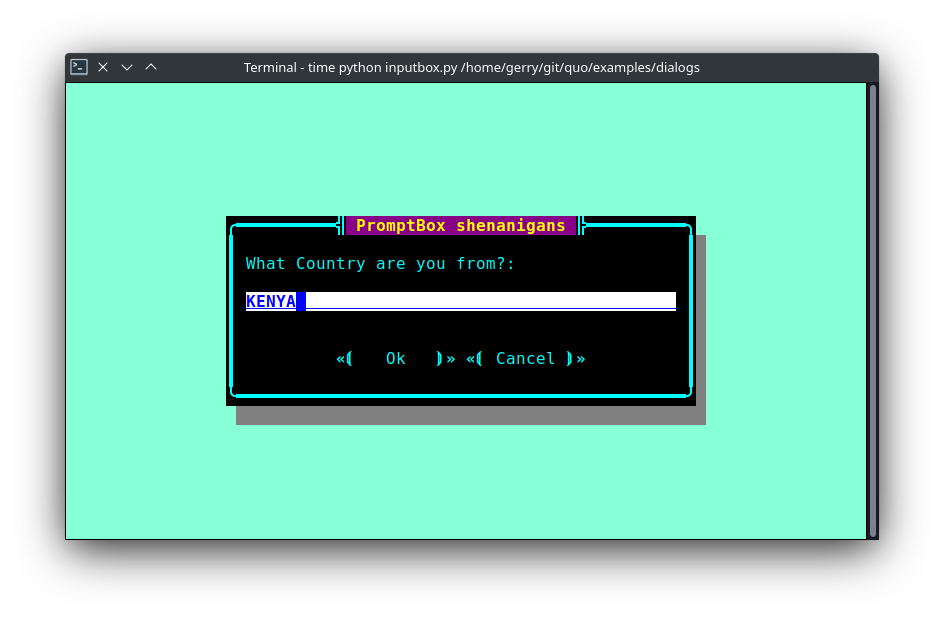
Input Box
The InputBox() function can display an
input box. It will return the user input as a string.
from quo.dialog import InputBox
InputBox(
    title='PromptBox Shenanigans',
    text='What Country are you from?:')
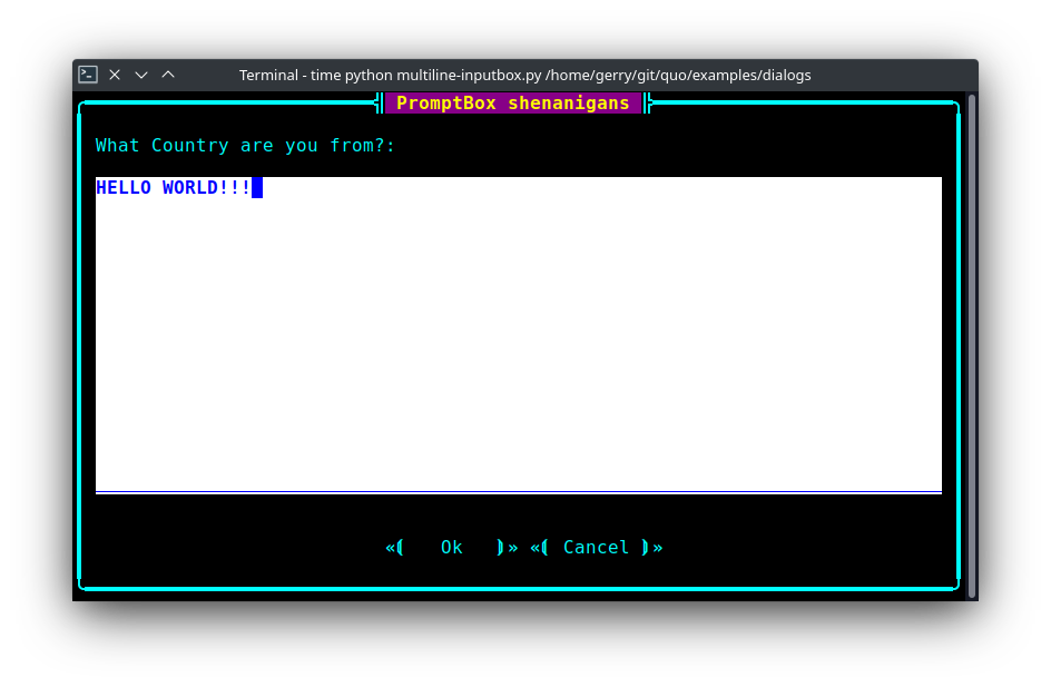
The multiline=True parameter can be passed to turn this into a multiline Input box
The hide=True option can be passed to the InputBox() function to turn this into a password input box.
Confirm Box
The ConfirmBox() function displays a yes/no confirmation dialog. It will return a boolean according to the selection.
from quo.dialog import ConfirmBox

ConfirmBox(
    title='Yes/No example',
    text='Do you want to confirm?')

Choice Box
The ChoiceBox() function displays a dialog
with choices offered as buttons. Buttons are indicated as a list of tuples, each providing the label (first) and return value if clicked (second).
from quo.dialog import ChoiceBox

ChoiceBox(
    title='Button dialog example',
    text='Do you want to confirm?',
    buttons=[
        ('Yes', True),
        ('No', False),
        ('Maybe...', None)
    ])

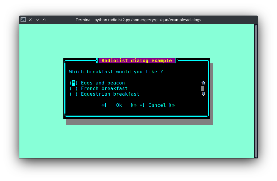
Radiolist Box
The RadiolistBox() function displays a dialog
with choices offered as a radio list. The values are provided as a list of tuples,
each providing the return value (first element) and the displayed value (second element).
from quo.dialog import RadiolistBox

RadiolistBox(
    title="RadioList dialog example",
    text="Which breakfast would you like ?",
    values=[
        ("breakfast1", "Eggs and beacon"),
        ("breakfast2", "French breakfast"),
        ("breakfast3", "Equestrian breakfast")
    ])
Check Box
The CheckBox() has the same usage and purpose than the Radiolist dialog, but allows several values to be selected and therefore returned.
from quo.dialog import CheckBox

CheckBox(
    title="CheckboxList dialog",
    text="What would you like in your breakfast ?",
    values=[
        ("eggs", "Eggs"),
        ("bacon", "Bacon"),
        ("croissants", "20 Croissants"),
        ("daily", "The breakfast of the day")
    ]
)
Styling of dialogs
A custom Style instance can be passed to alldialogs to override the default style. Also, text can be styled by passing an Text object.
from quo.dialog import MessageBox
from quo.style import Style
from quo.text import Text
style = Style.add({
'dialog': 'bg:aquamarine',
'dialog.body': 'bg:black fg:green',
'dialog shadow': 'bg:yellow' })
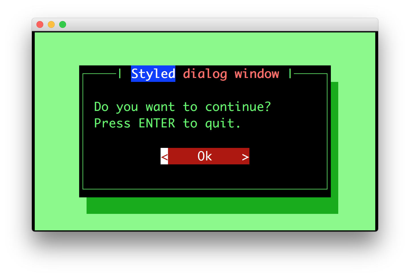
MessageBox(
title=Text('<style bg="blue" fg="white">Styled</style> '
'<style fg="red">dialog</style> window'),
text='Do you want to continue?\nPress ENTER to quit.',
style=style)
Styling reference sheet
In reality, the dialog commands presented above build a full-screen frame by using a list of components. The two tables below allow you to get the classnames available for each dialog therefore you will be able to provide a custom style for every element that is displayed, using the method provided above.
Note
All the dialogs use the Dialog component, therefore it isn’t specified explicitly below.
Shortcut |
Components used |
|---|---|
|
|
|
|
|
|
|
|
|
|
|
|
|
|
Components |
Available classnames |
|---|---|
Dialog |
|
TextArea |
|
Label |
|
Button |
|
Frame |
|
Shadow |
|
RadioList |
|
CheckboxList |
|
VerticalLine |
|
HorizontalLine |
|
ProgressBar |
|
Example
Let’s customize the example of the Check Box.
It uses 2 Button, a CheckboxList and a Label, packed inside a Dialog.
Therefore we can customize each of these elements separately, using for instance:
from quo.dialog import CheckBox
from quo.style import Style

style = Style.add({
           'dialog': 'bg:green',
           'button': 'bg:red',
           'checkbox': 'fg:blue',
           'dialog.body': 'bg:yellow',
           'dialog shadow': 'bg:khaki',
           'frame.label': 'fg:black',
           'dialog.body label': 'fg:aquamarine'})

CheckBox(
       title="CheckboxList dialog",
       text="What would you like in your breakfast ?",
       values=[
           ("eggs", "Eggs"),
           ("bacon", "Bacon"),
           ("croissants", "20 Croissants"),
           ("daily", "The breakfast of the day")
       ],
       style = style)
» Check out more examples here