Text User Interface (Full screen Command-line applications)
quo can be used to create complex full screen terminal applications. Typically, an application consists of a layout (to describe the graphical part) and a set of key bindings.
The sections below describe the components required for full screen applications (or custom, non full screen applications), and how to assemble them together.
Note
Also remember that the examples directory of the quo
repository contains plenty of examples. Each example is supposed to explain
one idea. So, this as well should help you get started.
Don’t hesitate to open a GitHub issue if you feel that a certain example is missing.
A simple application
Almost every quo application is an instance of an container(). The simplest full screen example would look like this:
from quo import container
from quo.label import Label

content = Label("Hello, world")

container(content)
This will only consume the least amount of space required.
Note
If we set the
full_screenoption, the application will run in an alternate screen buffer, in full screen mode.
Starting with v2022.4.5, ctrl-c will be the default key binder for to exit the app, you will still be able to define your own set of key bindings.
from quo import container
from quo.textfield import TextField

content = TextField("Hello, world")
container(content, bind=True, full_screen=True)
An application consists of several components. The most important are:
I/O objects: the input and output device.
The layout: this defines the graphical structure of the application. For instance, a text box on the left side, and a button on the right side.
A style: this defines what colors and underline/bold/italic styles are used everywhere.
A set of key bindings.
We will discuss all of these in more detail below.
The layout
Under the hood, class Layout is the layout for function container().
Here’s a simple example of a a text area displaying Hello World!
from quo import container
from quo.box imort Box
from quo.textfield TextField

# Layout for displaying hello world.
# (The box takes care of the margin/padding.)

textfield = TextField("Hello, world!!")

content = Box(textfield)

container(content, bind=True, full_screen=True)
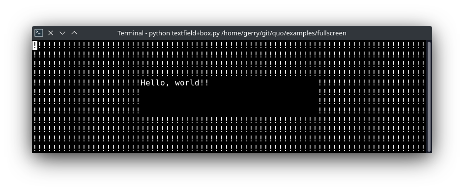
In the example above, the Layout consists of Box and TextField for displaying hello world.
The class Box takes care of the margin/padding and class TextField takes care of the text to be printed.
quo.container() prints the layout.
container
Print the layout to the output
- Parameters
container- AnyContainerbind(bool) - When True, initiate aBindinstance for the key bindings.full_screen(bool) - When True, run the application on the alternate screen buffer.focused_element- element to be focused initially. (Can be anything the `focus` function accepts.)mouse_support-Filteror boolean. When True, enable mouse support.style- A style string.
Here’s a simple example of a few buttons and click handlers.
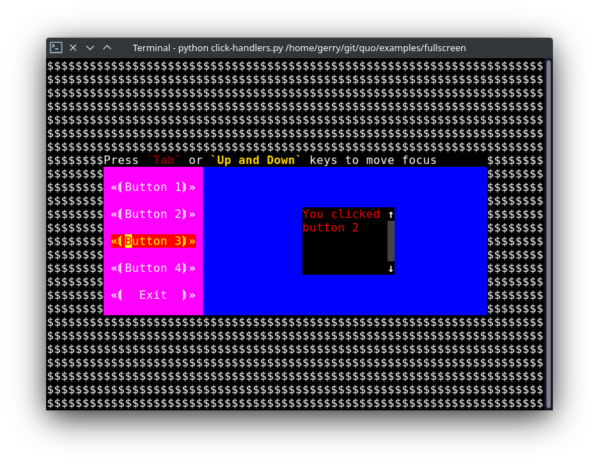
» Source code here
A layered layout architecture
There are several ways to create a layout, depending on how customizable you want things to be.
Examples of
Containerobjects areVSplit(vertical split),HSplit(horizontal split)
Windowobject is a special kind of container that can contain objects responsible for the generation of content. TheWindowobject acts as an adaptor between theUIControland other containers, but it’s also responsible for the scrolling and line wrapping of the content.
- Quo contains several widgets like:
Button,Frame,Label,TextField,
The highest level abstractions can be found in the
dialogmodule.
More complex layouts can be achieved by nesting multiple
VSplit,
HSplit
HSplit
Several layouts, one stacked above/under the other. like so:
+--------------------+
|                    |
+--------------------+
|                    |
+--------------------+
By default, this doesn’t display a horizontal line between the children, but if this is something you need, then create a HSplit as follows:
HSplit(subset=[ ... ], padding_char='-', padding=1, padding_style='fg:red')
Parameters
subset- List of childContainerobjects.
window_too_small- AContainerobject that is displayed if there is not enough space for all the subsets. By default, this is a “Window too small” message.
align- A VerticalAlign value. i.etop,center,bottomorjustify
width- When given, use this width instead of looking at the subsets.
height- When given, use this height instead of looking at the subsets.
z_index- (int or None) When specified, this can be used to bring element in front of floating elements. None means: inherit from parent.
style- A style string.
modal(bool) - Settingmodal=Truemakes what is called a modal container. Normally, a subset container would inherit its parent key bindings. This does not apply to modal containers.
bind-Noneor aBindobject.
padding- (Dimension or int), size to be used for the padding. -padding_char- Character to be used for filling in the padding.
padding_style- Style to applied to the padding.
from quo import container
from quo.layout import HSplit
from quo.window import Window
from quo.label import Label

# 1. The layout
content = HSplit([
       Label("\n\n(Top pane)"),
       Window(height=1, char="-"),  # Horizontal line in the middle.
       Label("\n\n(Bottom pane)")
       ])

# 2. The `Application`
# Press `ctrl-c` to exit
container(content, bind=True)
VSplit
Several layouts, one stacked left/right of the other like so:
+---------+----------+
|         |          |
|         |          |
+---------+----------+
By default, this doesn’t display a vertical line between the children, but if this is something you need, then create a VSplit as follows:
VSplipt([ ... ], padding_char='|', padding=1, padding_style='fg:blue')
- Parameters
subset- List of subsetsContainerobjects.window_too_small- AContainerobject that is displayed if there is not enough space for all the children. By default, this is a “Window too small” message.align- A HorizontalAlign value. i.eleft,centre,rightorjustifywidth- When given, use this width instead of looking at the subsets.height- When given, use this height instead of looking at the subsets.z_index- (int or None) When specified, this can be used to bring element in front of floating elements. None means: inherit from parent.style- A style string.modal(bool) - Settingmodal=Truemakes what is called a modal container. Normally, a subset container would inherit its parent key bindings. This does not apply to modal containers.bind-Noneor aBindobject.padding- (Dimension or int), size to be used for the padding.padding_char- Character to be used for filling in the padding.padding_style- Style to applied to the padding.
# Press `ctrl-c` to exit
from quo import container
from quo.label import Label
from quo.layout import VSplit
from quo,window import Window


# 1. The layout
content = VSplit([
         Label("(Left pane)"),
         Window(width=1, char="|"), # Vertical line in the middle.
         Label("(Right pane)")
         ])

container(content, bind=True, full_screen=True)
Key bindings
Global key bindings
Key bindings can be passed to the application as follows:
from quo import container
from quo.keys import bind

container(bind=True)
Registering Key bindings
To register a new keyboard shortcut, we can use the
add() method as a decorator of the key handler:
from quo import container
from quo.keys import bind
from quo.textfield import TextField

content = TextField("Hello, world")

# A custom Key binder to exit the application
@bind.add("ctrl-q")
def exit_(event):
      """
      Pressing "ctrl-q" will exit the user interface
      """
     event.app.exit()

container(content, bind=True, full_screen=True)
The callback function is named exit_ for clarity, but it could have been named _ (underscore) as well, or anything you see fit
Read more about key bindings
VSplit and HSplit take a modal argument.
Setting modal=True makes what is called a modal container. Normally, a child container would inherit its parent key bindings. This does not apply to modal containers.
Consider a modal container (e.g. VSplit)
is child of another container, its parent. Any key bindings from the parent are not taken into account if the modal container (subset) has the focus.
This is useful in a complex layout, where many controls have their own key bindings, but you only want to enable the key bindings for a certain region of the layout.
The global key bindings are always active.
Window
Window is a Container that wraps a UIControl, like a BufferControl or FormattedTextControl.
- Parameters
content-UIControlinstance.width-Dimensioninstance or callable.height-Dimensioninstance or callable.z_index- When specified, this can be used to bring element in front of floating elements.fixed_width(bool) - When True, don’t take up more width then the preferred width reported by the control.fixed_height(bool) - When True, don’t take up more width then the preferred height reported by the control.ignore_content_width(bool) - A bool orFilterinstance. Ignore theUIContentwidth when calculating the dimensions.ignore_content_height(bool) - A bool orFilterinstance. Ignore theUIContentheight when calculating the dimensions.left_margins- A list ofMargininstance to be displayed on the left. For instance:NumberedMargincan be one of them in order to show line numbers.right_margins- Like left_margins, but on the other side.scroll_offsets-ScrollOffsetsinstance, representing the preferred amount of lines/columns to be always visible before/after the cursor. When both top and bottom are a very high number, the cursor will be centered vertically most of the time.allow_scroll_beyond_bottom(bool) - A bool orFilterinstance. When True, allow scrolling so far, that the top part of the content is not visible anymore, while there is still empty space available at the bottom of the window. In the Vi editor for instance, this is possible. You will see tildes while the top part of the body is hidden.wrap_lines(bool)* - A bool orFilterinstance. When True, don’t scroll horizontally, but wrap lines instead.get_vertical_scroll- Callable that takes this window instance as input and returns a preferred vertical scroll. (When this is `None`, the scroll is only determined by the last and current cursor position.)get_horizontal_scroll- Callable that takes this window instance as input and returns a preferred vertical scroll.always_hide_cursor(bool) - A bool orFilterinstance. When True, never display the cursor, even when the user control specifies a cursor position.cursorline(bool) - A bool orFilterinstance. When True, display a cursorline.cursorcolumn(bool) - A bool orFilterinstance When True, display a cursorcolumn.colorcolumns- A list ofColorColumninstances that describe the columns to be highlighted, or a callable that returns such a list.align-WindowAlignvalue or callable that returns anWindowAlignvalue. alignment of content. i.eleft,centreorrightstyle- A style string. Style to be applied to all the cells in this window. (This can be a callable that returns a string.)char(str) - Character to be used for filling the background. This can also be a callable that returns a character.get_line_prefix- None or a callable that returns formatted text to atted text to be inserted before a line. It takes a line number (int) and a wrap_count and returns formatted text. This can be used for implementation of line continuations, things like Vim “breakindent”.
» Check out more examples here